Seven Steps to a Successful Illustration – Children’s Book Illustration Creation Process in a Nutshell.
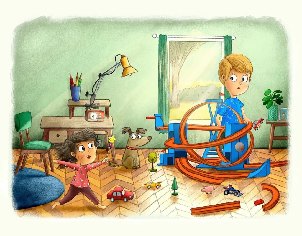
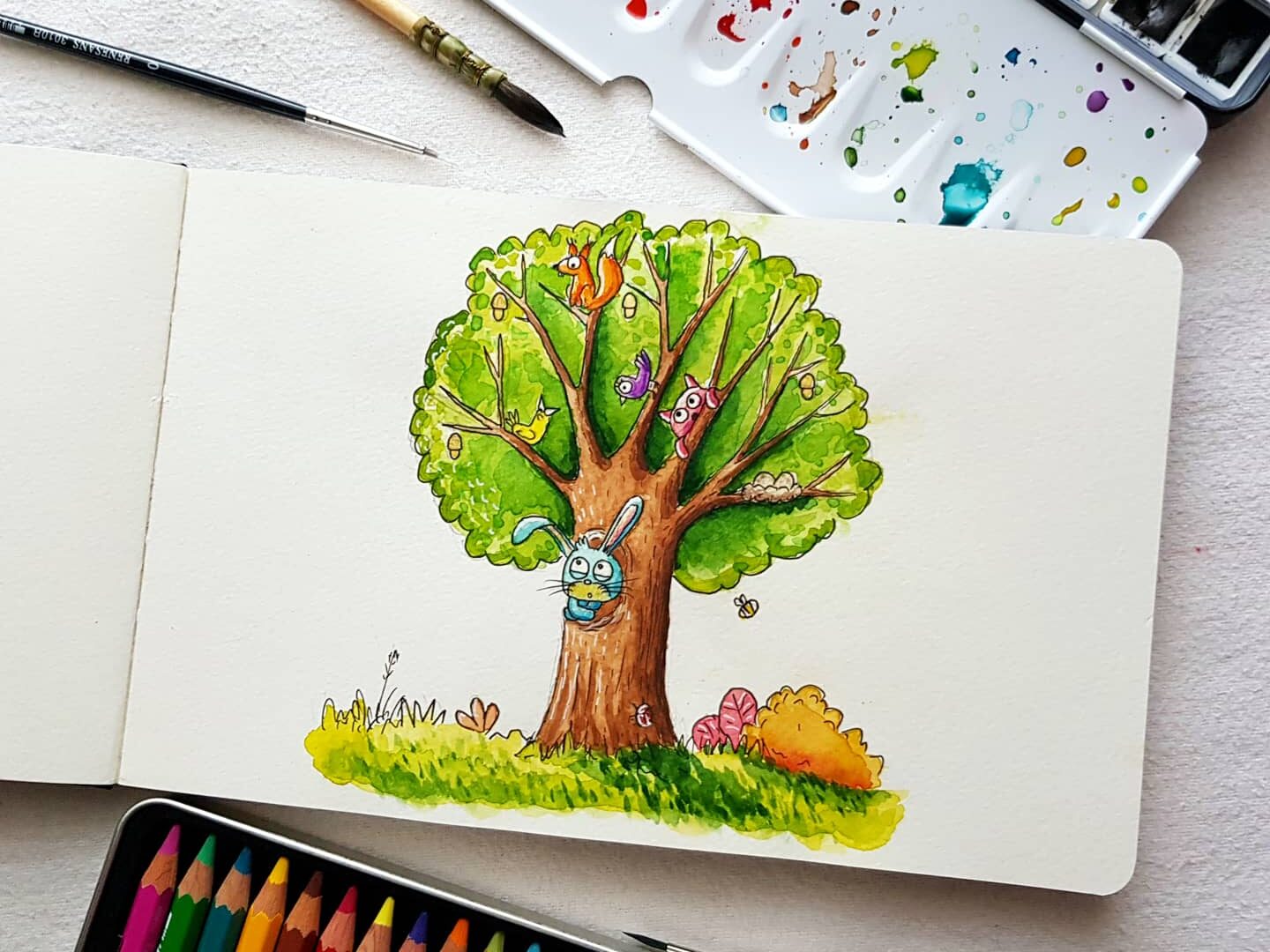
Have you ever wondered how do children’s illustrations come about? There are many techniques and artwork styles – from delicate watercolour stretching across sheets of paper through crisp graphic pen drawings to harnessing the power of a graphics tablet. Their choice depends on the author’s preferences, the book’s target audience, and the vision and interpretation of the scenery and characters. In today’s article, I would like to tell you a bit about my illustration workflow process. So, if you are interested, let’s get started without further ado!
.
Step one – idea comes first
It starts with a manuscript and illustration concept. As you read the text, your mind comes up with exciting ideas for layout design, initial drafts of characters, and scenes especially interesting for illustration. It’s true; the more engaging the book, characters, and setting, the more interesting drawings. However, even if the illustration topic alone is not particularly occupying, you may always turn the tables – play with the light, atmosphere, and typography, find an allegory, change the sizes or slightly enhance the composition.
Sometimes you may not find your way around a particular theme, but it’s worth the risk. Where some see obstacles, others see opportunities. Ideas are the beginning of the adventure to excellent illustration. Over time, our ideas get better, interpretations faster and more accurate, and reacting to understatements, additions and reading between the lines will become a habit.
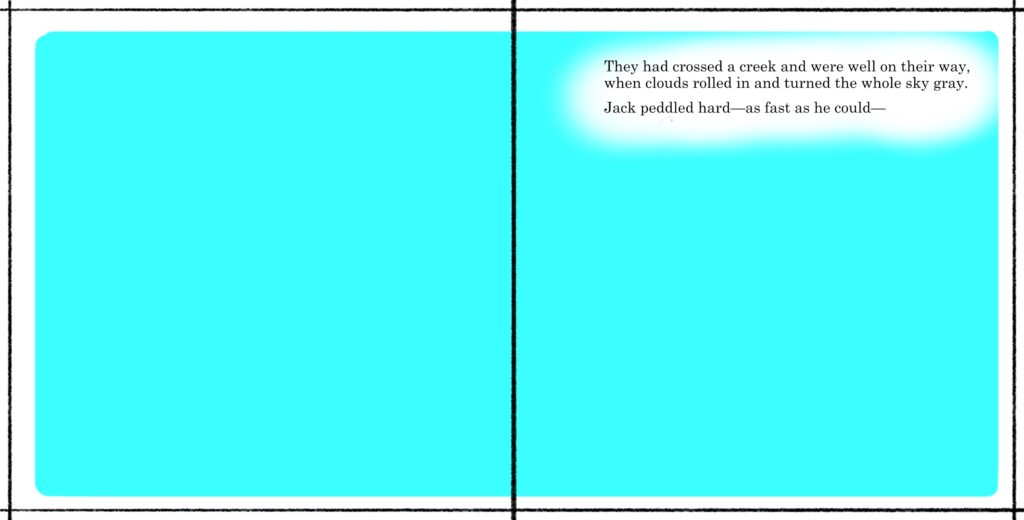
I start by creating a book layout and marking a place for illustrations and text. It is important to already have an idea for an illustration when creating the layout. The number of pages cannot change while working on the book. The scene must fit the text, not the other way around.
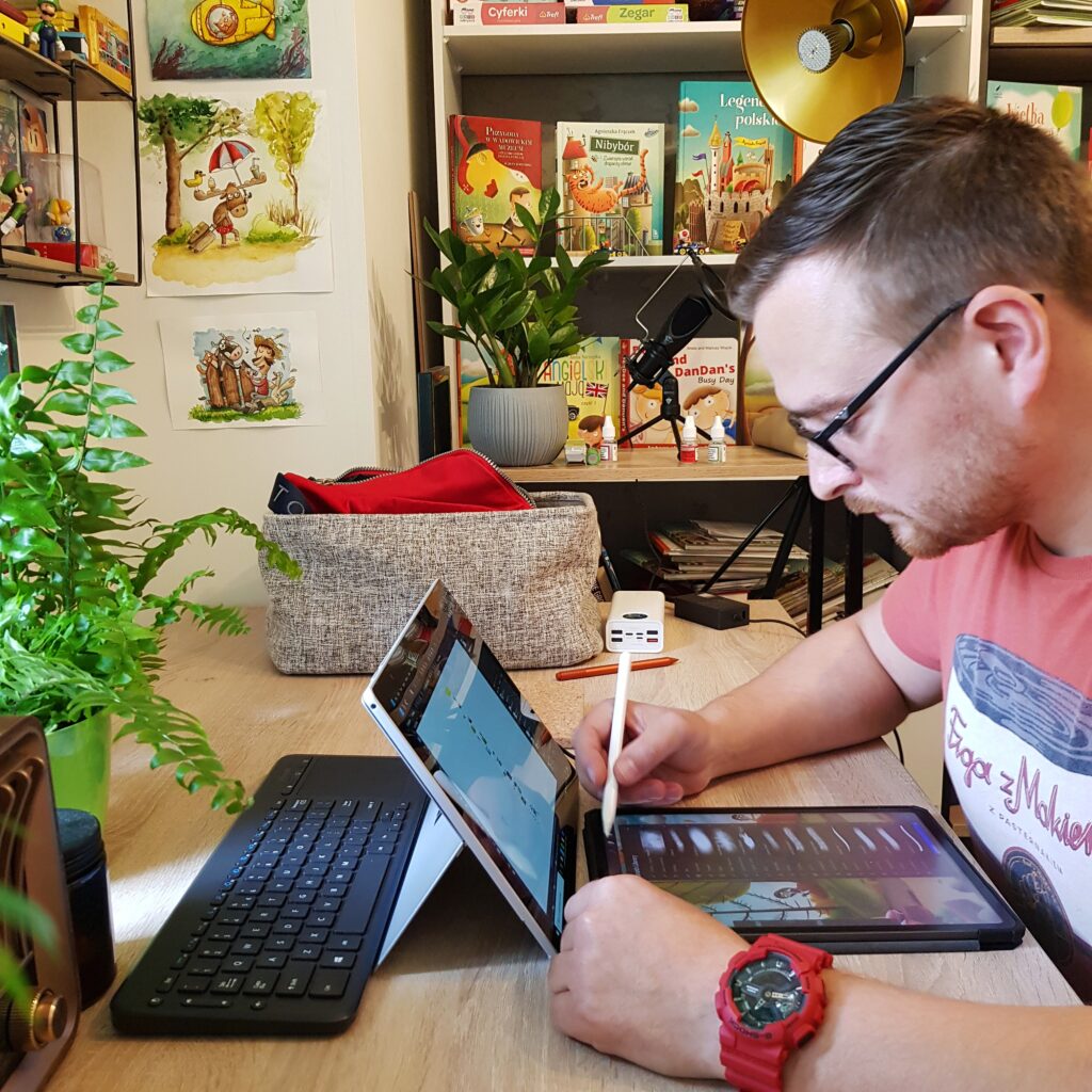
Step two – creativity bursts into a plan
Once we had familiarised ourselves with the illustration object, it is high time to get creative. Visualising the content of a book is a central part of the work. It requires imagination, ingenuity and flair. Illustrations may be ordinary and banal, but with a bit of thought they do not have to be. The special attention to the atmosphere of each scene, the appropriate planning of the space for the illustrations, their size, detail, tonality, colouring and message – all this makes the book outstanding and unique. At this stage, we jot down ideas or create an outline of scenes and characters by sketching solids on a mock-up with text, collect reference graphics, and re-read the design guidelines and brief a few times.
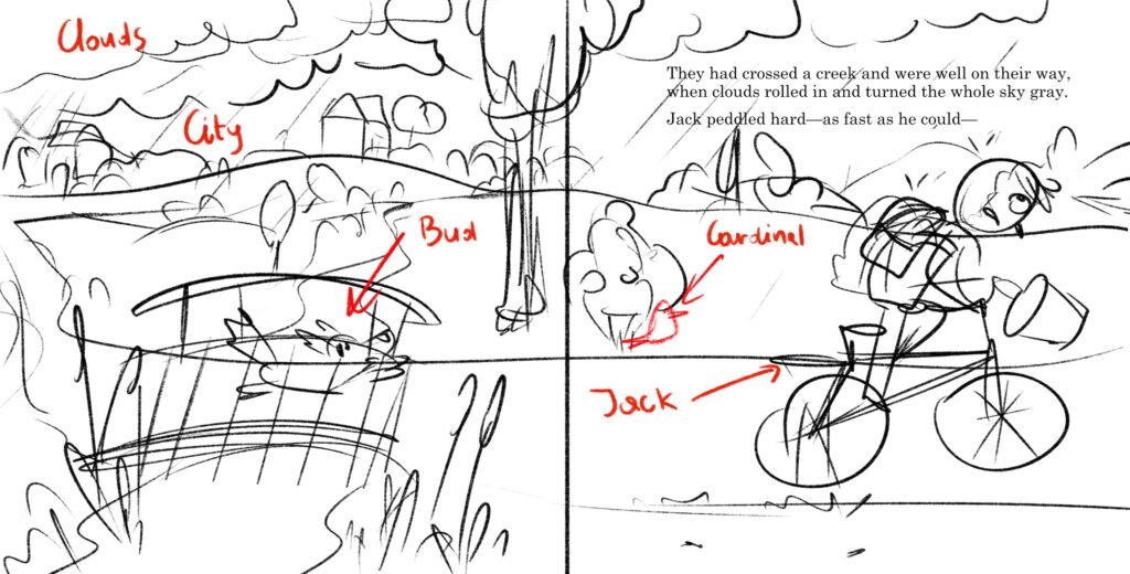
A loose sketch is very important, it contains the composition and outline of all the elements that will be in the illustration. At this stage you can distinguish all the elements and the text layout without details.
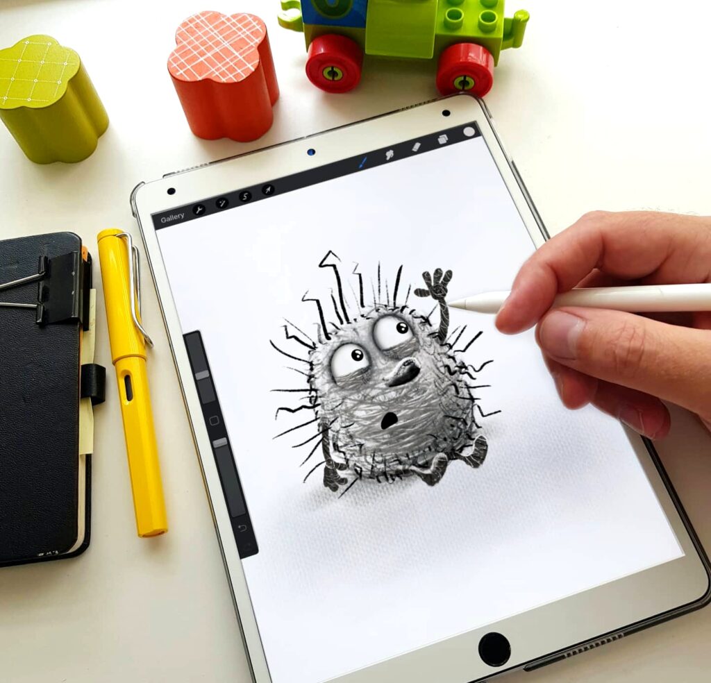
Step three – sketch time
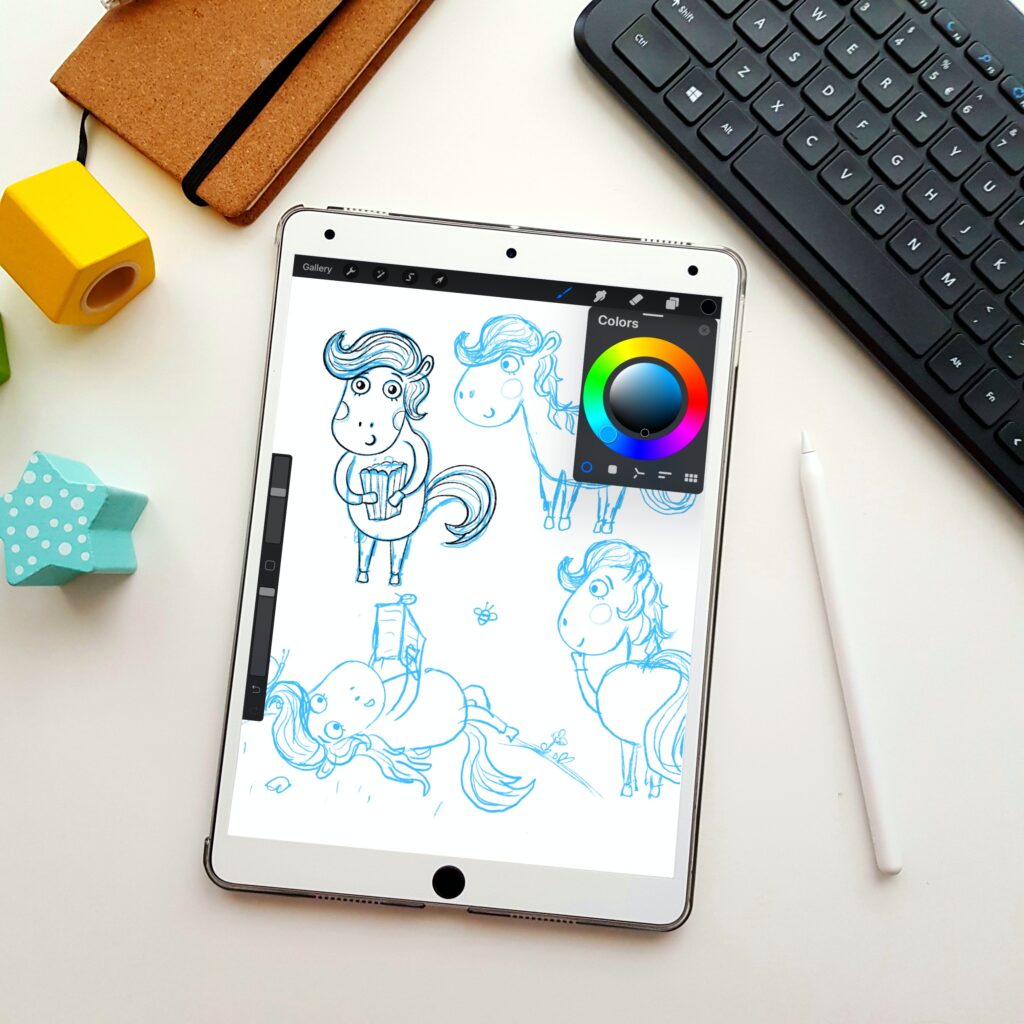
Now all that is left is to convert the idea into a sketch. Here we develop the characters, the world elements, and a more detailed outline of the scenes. It is the time for experimentation, revision and vision change. It is a challenging stage. Everything that has so far had an idea and lacked form. Sketching resembles sculpting, where characters, scenes and the whole world come into being through our imagination.
Our job is to tell the story visually; we are the link between imagination and vision. We keep what is vital and apply different criteria. The character needs to be interesting, sympathetic, and intriguing, while any pot or bicycle should resemble the real deal. We can interpret one text in many ways and create different sketches of the same scene or character. Sketching is a crucial stage of design. Each draft must also have a coherent cause-and-effect sequence and reproduce the actual object as well as possible.
I refer to both the characters, the plan layout and the arrangement of other recurring elements. Adequate representation involves creating a series of illustrations belonging to one set and that the character in each drawing is the same. We cannot get lost on page after page because of inconsistencies. The linearity of the plot and the presence of the same characters make us focus on the characters first and then on the story. A skilful rendering of a vision in sketch form is a vital stage of illustration preparation. Combining the right idea with our idea of the characters and our sketching skills are the factors that influence the final shape of the image.
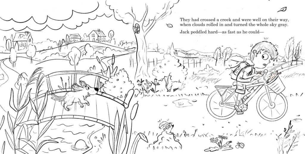
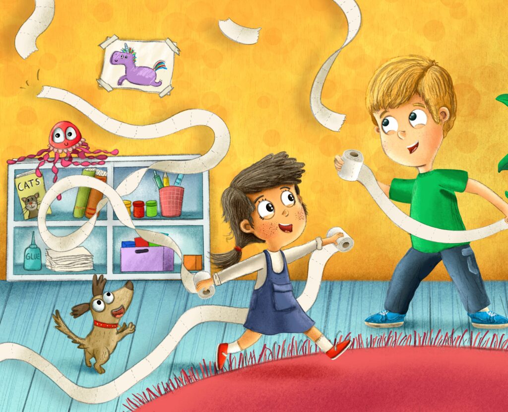
The final sketch must be perfect, like a lineart. This is the last stage for changes and corrections. All details are visible, sharp and clear.
Step four – detail check
It is downhill from there – all you have to do is to double-check everything, and then it is time to colour. Sometimes a character or scene needs to be slightly modified. Chances are that some elements may not fit together visually, or our idea has ripened and needs to be revised. It is not bad so long as it is a deliberate modification. It is worse when we spot mistakes or blatant mismatched features, such as the distance between the eyes or the shape of the character’s face. Mismatched colours are easy to edit, but perceptually disruptive proportions that scream for help can ruin the whole image. Illustration with such errors is a failure – instead of focusing on the aesthetics, the message, and the exploration of emotion and detail, the reader seeks out the flaws and sees distorted eyes, bared teeth, bizarre facial features and unnatural positioning of the character’s body.
Step five– colour time
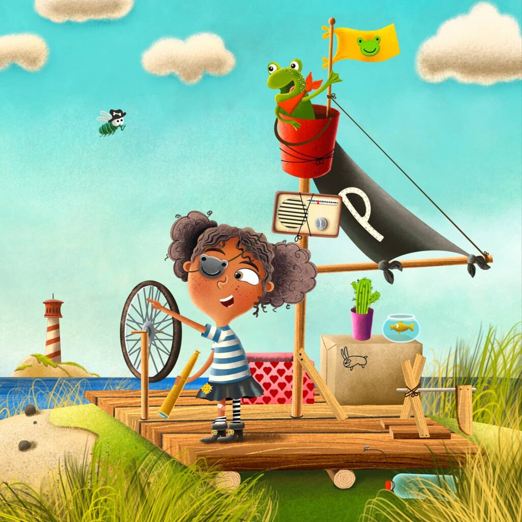
The choice of colour scheme is significant regardless of the style or technique of the illustration. We aim to make reading a book an enjoyable but not tiring journey for a child. It is well known that there are better and worse illustrations, even despite the best efforts, and there is no point in comparing a spread to an ornament. The colours in full-page or double-sided illustrations are bound to create an atmosphere. All colours have to match each other and fight at the same time – to swarm with each other and fight for our attention. However, we do not aim to achieve this through haphazardness, blending, and blurring as necessary but through a specific plan, selection and contrast. A viewer’s exposition serves as engaging photography. Poorly chosen hues turn on a warning light and push you towards looking for other inaccuracies. Some colours can repel, and combined with garish sketches and gobbles the whole illustration becomes a flop rather than something that holds children’s attention.
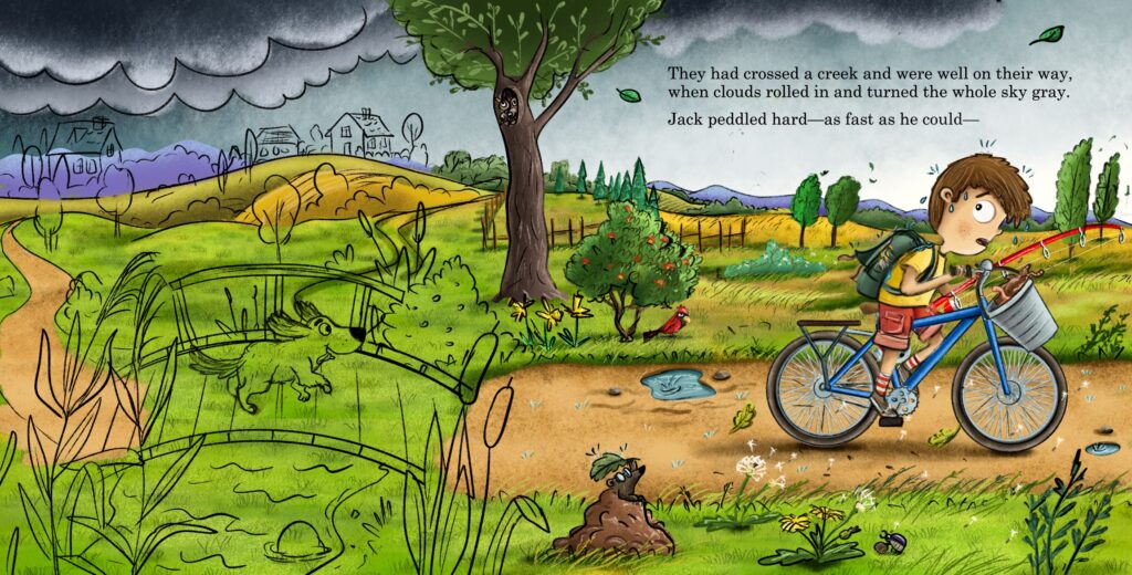
Choosing the right colors for illustrations is crucial. This is how I build the scene and atmosphere of the illustration. A sunny day looks different from a cloudy morning. Beginning artists often make mistakes, their characters have gray complexion, the grass is dirty, the details are difficult to read, and the shading is very blurry and black.
Step six – finishing touches
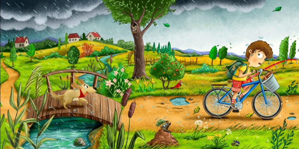
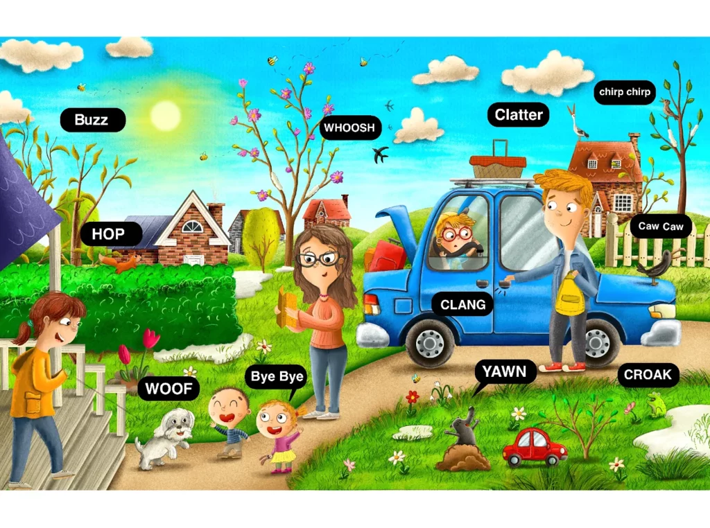
Many things can go wrong – no graphic designer or artist is completely 100% happy with their work. And that’s good because the desire to improve gives us the strength to change. We need to foster our inner critique to grow. The sooner we acquire this skill, the better. Therefore, in the final phase of the illustration process, we check everything and move on to the icing on the cake, the cover.
We review the entire collection of illustrations, reread the text and check that we have not left something out. We even out colours, contrast, and saturation if some illustrations deviate from the rest. Proofreading helps maintain visual consistency. And we check how the illustrations fit with the flowing text.
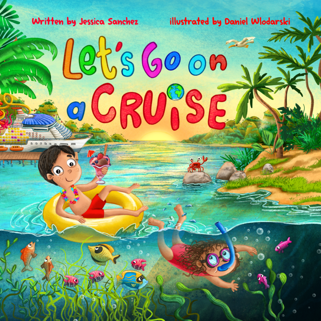
The cover is supposed to attract attention, represent what the book is about and encourage people to read. Often beautiful content can disappear under a stereotypical, ill-conceived cover. The cover is our business card, so it’s worth taking your time with it.
Step seven – prepare for printing
The last step is to prepare the files for printing. You need to make sure everything is perfect when you send files to a publisher, self-publisher, or printing house. Remember that there are different printing specifications and each printing house has its own rules, so it is better to leave a larger bleed than too small. Why is all this so important and why do you need to follow the process to the end? Because only then can you be sure that your book will look as you planned. Anyway, see the examples below.

Mistakes
The most common mistakes result from communication. A poorly constructed brief and work description often mean that the artist has to make a lot of changes and edit his work while working. A well-thought-out job description and leaving space for the artist to create art creates an atmosphere and comfort of work. The most important thing is to trust the artist. Each of us knows the work we do well and loves doing it. Therefore, it is worth trusting our experience to get great illustrations for our book.
There is a place and time for everything. At the sketch stage, there is always an opportunity to discuss details and ideas. You can correct some elements, but it is always worth leaving the artist’s vision and his view of the scene he is building so that it is consistent with his vision of the entire book. It’s better to be pleasantly surprised than to realize the author’s ideal vision which will never be fully captured. I do not deny that some ideas are good, but they must be sent at the beginning of cooperation so as not to add unnecessary work while working on the illustrations.
Preparing files for printing in the CMYK format, adjusting the color tone, improving brightness, contrast, saturation, setting the text to 100%K, exporting files in the FOGRA 39 color profile or exporting files to Amazon KDP, it may seem complicated but it is not at all once you learn it. At this stage, you cannot afford to make mistakes because it is easy to destroy the entire work if you prepare the files for printing improperly, so be careful.Remember that your tablet, monitor or computer is not always able to display CMYK files, so you will not be able to see what the files will look like when printed. Some programs won’t even display the right size so you won’t see your design at 1:1 scale.


When does a book succeed and become a bestseller?
Smart, funny, properly designed and illustrated books, in which the main character is pleasant, cute and unique. Children often return to such books, so make sure that your book has all the features of a good book and is of great value to the child. Think through your text and make the story interesting. The illustrations in such a book must be refined and of the highest standard. When I create illustrations for the second, third or fourth part of a book, I know that the book is good and that children like the story. A few thousand copies of a book may be sold, but if the book is well designed, the story is good and funny, then the sales will not stop at 30,000 copies but will go up. I think it is worth putting in the effort not only to write the book, but also to help the illustrator in creating the book and to think through the brief appropriately and leave the illustrator creative freedom, create appropriate conditions for friendly cooperation and transparent and quick communication.

The process of creating illustrations for children – summary
Bravo! That’s the end of it! We have gone through the illustration creation process together. While some are born in pains and revisions, others fly out as a vision and spill out under our fingers. They are fleeting and delicate, flamboyant and assertive, colourful and joyful, coarse and mysterious, ugly and pretty, depending on taste and preference. Thoughtful and amateurish, as well as spontaneous and professional – and all are fine! The important thing is that they accompany the little readers.
Thank you for reading, and we look forward to the next episode of our shared adventure with children’s illustrations soon.
Thanks for reading.
